
Finding affordable flight deals
| App Design
■
■
■ ■
Overview
The client is a platform that empowers users to book international and domestic (U.S.) travel deals. Offering both free and premium options, the service boasts substantial savings, typically ranging from 40% to 90% off standard fares.
The task
Our task was to create the the App, inspiring users to explore new destinations with enticing deals based on the conducted research. Initially a web-based platform, our challenge was to transform it into a user-friendly mobile app with a clear and scalable design system.
Role
UX Designer
Tools
Figma
Duration
5 months
Responsibilities
Ideation, wireframes, user flows, prototyping, collaboration with a Strategist, client team and visual designers on the team.


Understand
■
■
■ ■
Gathering the requirements
During this stage, I collaborated with fellow UX Designers and Strategists on the team to grasp user needs and business objectives, primarily based on the information provided by the client's team. The client team shared valuable insights into user behavior derived from their active web platform.
Specifications and Requirements
We proceeded to gather and validate project requirements and specifications through stakeholder interviews. Through these interviews, we landed with the primary goals for the app design:
■ The client's platform educated users about the importance of flexibility in securing successful deals. Typically, travelers decide on their holiday dates before booking flights, The client team wanted to encourage users through attractive deals presentations, destination presentations, and educational pieces to be more flexible.
■ In light of this, the client team aimed to encourage users to explore various deals through new deal discovery mechanisms the app was designed to facilitate.
■ Additionally, we considered incorporating gamification elements to enhance app retention.
■ One of the technical requirements was to focus on building a scalable design system.
■ I was also responsible for preparing testing scenarios and testing scripts that the client research team performed on their side.
These insights shaped the design approach, ensuring that the app catered to the unique behaviors and preferences of platform user base.
Ideation and brainstorming
■
■
■ ■
In this phase, we ideated on Information architecture scenarios and it’s consequences. The main app areas emerged (an example of ideation around a few sections). Full ideation below.
Explore Page
Business Objective:
Inspire people to consider:
A deal
A destination
An upgrade
A contribution (CTA to fill in more of their profile, share a trip, or the fact that they booked something)
Potential User Pain Point:
Content overload - Good to use hierarchy/design to differentiate content types
Watchlist
Business Objective:
Learn more about a user's travel preferences.
Serve users the best deals to the places they want to go to.
Prompt users to turn on notifications.
Nudge users to upgrade their membership.
Potential User Pain Point:
Too much or too little content on this page. How can we help serendipity travelers know what to save in their watchlist?
Search
Business Objective:
Help users find the content that they are looking for (by allowing them to search for anything or suggesting search options).
Results Objectives:
Leave towards another page
(record data to understand user preferences)
Potential user painpoint:
Can there be too many or too few search results?If there are too many results: Assist with filtering options.
If there are too few results: Suggest alternatives (e.g., "Oops, your search did not yield many results, but here is some additional inspiration or suggestions for your search").

To access the PDF version, simply click or tap on the image above.
Highlighted work
■
■
■ ■
In this case study, given the app design's multifaceted nature and inherent complexity, I have chosen to highlight key aspects of my work that present my approach and the proposed solutions in the Definition phase of the process.
Explore page
■
■
■ ■
Explore Page: Use Cases
As a user, my objective is to discover the best deals for my summer vacation in order to save on expenses.
As a user, I wish to peruse the best deals departing from my local airports, enabling me to plan my vacations accordingly.
As a user, I seek inspiration for my Christmas vacation destination, desiring a unique travel experience.
As a user, I aim to stay updated on trending deals and destinations within the community.
As a user, my goal is to uncover the best deals for any trip, without specific time constraints or a predetermined destination.
Explore Page Ideation: Sketching
During this ideation phase, my focus was initially on the above-the-fold experience of the Explore Page. This pivotal moment provides an opportunity to captivate user attention and introduce them to diverse methods of exploring deals. These methods are intrinsically tied to reinforcing a user's inclination toward greater flexibility regarding travel dates when booking deals. Below you can see selected sketches and how those evolved over time.
01 | Exploration: What kind of destinations are you looking for?
Exploration of deals displayed on the Explore Page based on their preference for more quiet or adventurous destinations. This concept was later refined as "How adventurous are you feeling today?" in later explorations. This approach included that each destination would be tagged internally based on that filtering.
Addressing Pain Points: While this filtering approach has benefits, it's important to acknowledge potential drawbacks. By filtering deals, there's a risk that users might miss out on enticing offers that fall outside their usual comfort zone. This filtering can simplify a destination to an unrealistic degree.
02 | Exploration: What you are looking for?
Exploration of deals displayed on the Explore page based on their preference of what type of trip they are looking for, more family-oriented, work or solo adventure. This approach included that each destination would be tagged internally based on that filtering.
Addressing Pain Points: By filtering deals, there's a risk that users might miss out on enticing offers that fall outside the filtering. This filtering can simplify a destination to an unrealistic degree and in the end we didn’t move forward with it.
03 | Exploration: Suprise me
Exploration of deals displayed on the Globe element through a Suprise button in the proposed answers in Search.
Addressing Pain Points: The placement of the “Suprise" me” CTA was too hidden, so we decided to focus on the idea of an interactive Globe element and how this element can be used for Hot Deals discovery.

■
■
■ ■
Explore Page Ideation: Wireframes
At this stage I took ideas that had the most potential to the wireframe format and from there continued exploration. Wireframes below.
01 | Exploration: Hot Deals Cards
Our main emphasis is on the Hot Deals cards, which are available for a limited time.
02 | Exploration: How adventurous are you?
We aim to understand how adventurous users are feeling today and then customize the deals on the Explore page accordingly. Based on the sketch idea presented before. This idea was rejected during internal user testing because users were unable to understand the type of results they would receive after the interaction.
03 | Exploration: The Earth Discovery Element
We're focusing on Hot Deals presented in two ways:
The globe displays Hot Deals interactively.
Hot Deals cards are available at all times for easier browsing of deals.
Reasoning Behind Choosing this Concept for the Explore Page:
Providing users access to hot deals in two formats: explorative (The Globe) and standard (Deals Cards).
The Globe discovery feature allows for a fun interaction with deals by spinning the Earth.
Below are the standard Deals Cards that are accessible at all times, allowing users to switch to a more standard discovery mode.

Explore Page Ideation: Wireframes
Subscriptions differences and elements variations for the purpose of design system.
Below, you can see wireframes representing different subscription plans within the app (Premium, Limited, and Elite). For example, the Elite plan allowed users to search for international and domestic attractive deals, while the Limited plan enabled users to find business-class deals."
That distinction is visible within the Popular Destinations element, where we give users the option to upgrade or be educated on their current plan and its perks.

Explore Page Ideation: Subscription levels

Explore Page Ideation: Elements variations
■
■
Globe: Final Wireframes
We ensured to creation of a comprehensive wireframes' flow, illustrating the connectivity between screens. Screens linked to the Explore Globe Feature include the Explore page, featuring the positioned globe, Deals Pages, and Destination Page.

To access the PDF version, simply click or tap on the image above.

Animated transition to Explore Page
Explore Page: Final Wireframes
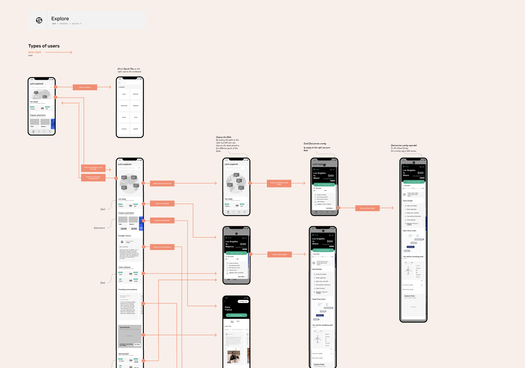
To access the PDF version, simply click or tap on the image above.
Onboarding exploration
■
■
■ ■
| Step 1
Understand current onboarding process on the web platfrom.
| Step 2
Ideation and validation of approaches.
| Step 3
Working on finalized flow.
| Step 1
In the process of understanding current onboarding included:
1. Sign up
2. Intro message: we have a few questions for you
3. Main home airport
4. Prefered Destinations
5. Near airports -->Airports that users will get deals from
6. Type of deals users want to be notified about --> upsell + Education
7. Upsell to Premium (Membership info)
8. How did you hear from us
We could understand the main segments which are:
■ airport preferences,
■ notification preferences,
■ memberships,
■ feedback,
■ sign up details.
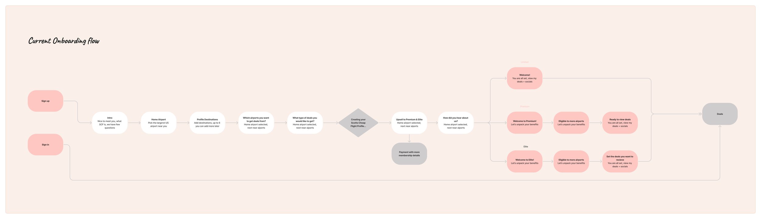
To access the PDF version, simply click or tap on the image above.
While brainstorming various approaches, one of the ones that I found interesting was presenting product value early on, which is a common practice before the signup. I decided to explore the idea of conversational onboarding, which would serve as a bridge between presenting product value early on and gathering user preferences.
Below are two items:
Onboarding flow presenting the key structure of the proposed approach
Prototype with wireframes presenting the key screens of the proposed approach

UX Design Onboarding Flow
To be continued..
■
■
■ ■
Case Studies
☻
Case Studies ☻

Flavourit App MVP: democratising wine tasting
UX Design | App Design

Transforming the recruitment process with an interactive AI avatar
UX Research | Testing